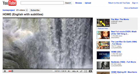
YouTube is currently testing out a new layout of its video page, a more simplified and streamline video page if I may say so – all for the hopes of offering the best possible watching experience to users. The new video page is currently on an opt-in  basis, but anyone can try it out even if their primary language is not English. However, all the elements in the video page will be in English.  Like any of its opt-in feature, you can easily go back to the old video page via a single click.
So, what does the new video page offers? There’s quite a lot actually and these include:
Streamlined look and functionality – The new YouTube video page is now more subdued, stripped down, and simpler than before. Â The redesign was aimed at offering advanced features in the highest way possible for users. The new YouTube video page focuses more on the video rather than the add-on elements that you see on a normal YouTube video page.
Smarter “next up” video list – This is a pretty cool feature of the new YouTube video home page. It takes into consideration how you found a particular video and will queue your next video to watch based on how you arrived at the current video. For example if you’ve used the search facility, the rest of the search results will be placed on the right side of the video page – making it easier for  you to check out the rest of the video search results.
Less cluttered design and united description and stats – You can now find more specific information about the video you’re watching in one place – underneath the video. If you click on “description”, you’d see more information about the video you are currently watchin.
Action Bar  is Now Cleaner –  The new YouTube video home page now has a cleaner “sharing” action bar. Sharing, rating, saving or flagging a video are now all grouped in one place.
Simpler Video Rating Scheme – Yes, it’s now a matter of selecting – “like or don’t like. Sound s familiar? In addition, if you like a video, it will be automatically added to your favorites.
New labels for video size and video quality controls – Aside from the usual selection of how you want to view a video, YouTube is also offering new size control .
Search while you watch – While watching a video, you can conduct a search and the results will be displayed on the right side of the page.
More prominent channel/subscriber placement and a new “see more videos” feature –
The “subscribe” button is now placed on the top of the video, right near the title. In addition, there’s is now an arrow next to the number of uploads on the person’s channel to let you view more videos from uploaded by that person. Â Hence it’s now easier to find other videos.
If you want to try out the new YouTube video page, click here.
Originally posted on January 21, 2010 @ 4:06 pm
How the heck do I turn this off; it’s extremely annoying.