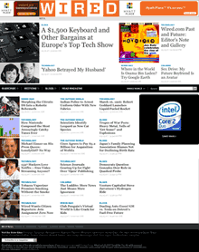
 So the new Wired site is here. What do you think? Personally I think it’s a step in the right direction. They have maintained their visual identity without being crippled by it. And the number of ads are surprisingly low, hopefully that is a new trend. Then again, that only means that the ads will cost more on these big hotshot sites.
The top part, around the logo, on the front page looks bad though. The sub pages need work though, too wide text columns and a bit more line height would do them good.
What do you think?
By the way, don’t miss the Wired design stroll down memory lane.
Originally posted on March 16, 2007 @ 8:38 am
I don’t know. It looks very old fashioned to me, like 1950’s hobby magazines. Having said that, The Times (London) has gone the same route — all blocky straps and big features. Hmmm. Let’s hope it’s a passing phase. ;-)
Well, blocky is what Wired does best. :)
Blocky and big is in. Time’s redesign did the same thing.
Nice! I agree that it looks old fashioned but I love that. It is Wired, it has got tech heritage and its visuals should reflect that.