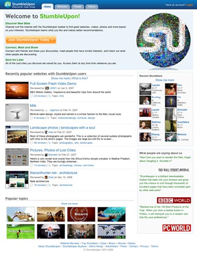
The toolbar powered social bookmarking site StumbleUpon have launched its new design, and it’s looking pretty good. Also, it’s looking pretty much like social sites tend to look, something my buddy Muhammad Saleem points out over at Pronet Advertising.
Here’s a screenshot:

The sub pages makes use of the layout from the front page pretty well, with tags to the right and listed stories to the left. That big welcome blurb you see on the front page isn’t used however, maybe it could be if they added some moderated top story system, although the blurb’s a bit big for that. Videos just list the videos, the best way to do it actually.
All in all, I think it’s a pretty decent redesign that could do with a bit of polishing (especially spacing around the top). Go check it out.
Originally posted on April 10, 2007 @ 2:41 am