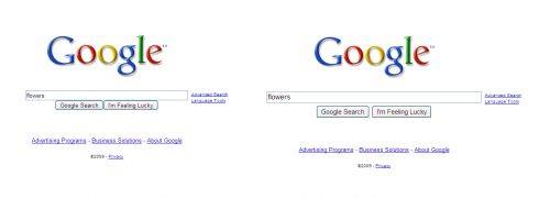
The kids have gone back to school and Apple has made its annual iPod/iTunes announcement, so perhaps that will explain why Google is making a bit of a thing about the marginal increase in the size of its search box.
On Safari on a Mac I can’t see any difference, so either it hasn’t rolled out yet or it’s something that only Chrome users can see.
In any case, if I want to make the search box bigger I just press Cmd and +. In fact, that works in a lot of places in Mac OS X and I don’t really need other people making themselves look bigger by default.
Nothing has changed in the search results — Google already added new features a few months ago. Nope, just a slightly bigger search box (if you’re using the “right” (read, Google-developed) browser.
“Google has always been first and foremost about search, and we’re committed to building and powering the best search on the web — now available through a supersized search box.”
Hardly supersized. Now, if you’d like to hand me your CSS file I’ll show you supersized. It’ll be nearly unusable, but that’s not the point is it?
Originally posted on September 10, 2009 @ 12:21 pm

Personally, I find this change to be completely unnecessary. My first complaint is that my default Mac OSX buttons are replaced by big ugly square ones, reducing the relationship to their function.
Secondly, while larger inputs on the home page feel aesthetically unbalanced, they do not create a hierarchy problem. The same can not be said about the search results page. Here, my eye at least, is drawn exclusively to the horribly large text box, and the query I just entered, while distracting me from the results.
Thirdly, current generation browsers are supporting much better text scaling and scale choices are best left up to the user. Arguments for the visually impaired, or resolution accommodation fall flat for this reason, and if you do happen to use a larger scale at your browser level prepare to understand what “S-U-P-E-R-sized!” (sic) really means.
It’s nice that Google is so “excited” about this change, but I think it’s a step in the wrong direction when it comes to usability and respect for their customers.
(I’m seeing the changes on a Mac running Safari 4)