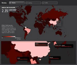
 You’ve probably asked yourself at least once “why is the f’ing Internet so slow?” One way you may be able to get some answer going forward is Akamai Technologies’ new “Visualizing the Internet” tools.
These Visualizing the Internet tools, unveiled by Akamai today, let you see how healthy the Internet currently is. Akamai draws upon information from over 25,000 servers in more than 750 cities that are used by content providers to provide visual data of why some Web traffic may be slow, infected, or simply non-existent.
Three tools make up Akamai’s offering. A real-time web monitor “identifies the global regions with the greatest attack traffic, cities with the slowest Web connections (latency), and geographic areas with the most Web traffic (traffic density).” Network performance comparision “illustrates how Akamai identifies the fastest and most reliable path available between an Akamai edge server and an enterprise’s origin data center to retrieve dynamic content.”
The final tool, visualizing Akamai, “provides insight into the world’s online behavior at any given moment including how much rich media is on the move, the sheer volume of data being requested, the number and concentration of worldwide visitors, and average connection speeds worldwide.” This data is drawn upon the fact, Akamai said, that at times it handles 20 percent of the world’s total Web traffic.
Originally posted on June 7, 2007 @ 3:01 pm