It is hard to resist the temptation of populating your website with animations or interactive features these days. WebGL, dynamic storytelling experiences, VR-powered videos – all these solutions are so trendy and so alluring that it seems that everyone is after them. However, there is still room for some time-proven tricks that thanks to modern advanced techniques have got new enhancement.
The experiments with the typography are one of them. The web platform boasts of having a constantly replenishing collection of outstanding type-based concepts that are refreshing and inspiring. From simple hover effects to interactive features, the diversity is impressive. However, the majority of projects out there remain as concepts, which were brought to life in a lab with ideal conditions. But what about the nonfictional websites? Is there any chance to stumble upon one in a wild? The truth is that the chances are slim: the experiments like the endangered species are rare, but still they exist and have something to show off.
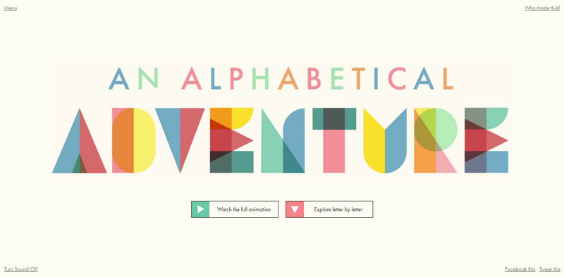
Consider An Alphabetical Adventure. The project offers the visitors to get acquainted with the alphabet in two engaging ways: either with the help of the video or character by character where each one is set into motion and accompanied by the small animation for better perception.
An Alphabetical Adventure serves as a great example of how to display the typeface these days. It encourages you to make your presentation live, interesting and artistic.
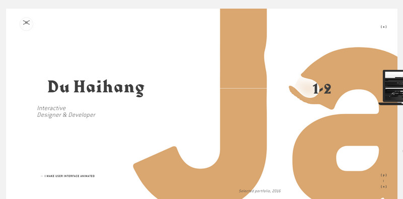
Of course, this example is one of a kind. Let’s explore down-to-earth websites: they also have creative ideas. From outstanding and advanced solutions like in Portfolio of Du Haihang where the amazing WebGL-powered masterpiece serves as a background and a tool for enriching general impression to simple and rustic solutions like in Personal portfolio of Chris Biron where “Keep it simple” lettering can be moved in y-axis by a scroll.
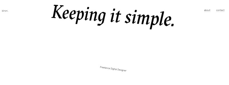
Following “Keep it simple” maxim
Scroll triggered effects are not new to us; actually, they increasingly overpopulate interfaces around the web, contributing to visual experience in all sorts of the websites from businesslike to fancy ones. Let’s consider High Five Bro, whose website’s home page seems to be just a carefully arranged bunch of lines of text.
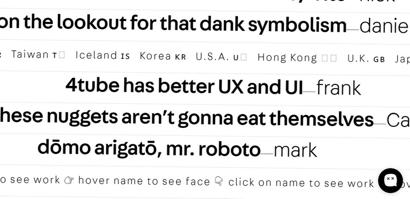
It features solely text; there are no images whatsoever. But this is only at first glance. When you scroll down, the content starts to twist and move; each line includes a keyword accompanied by a tooltip with additional data. In general, the interface has a primitive appearance, but thanks to original idea it feels exceptional and offbeat in a positive way.
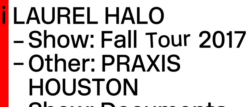
Another example is the online portfolio of Laurel Halo. It looks much like the High Five Bro but here every word is supplied with a dynamic effect.
Both previously mentioned websites prove that simple typography can bring a valuable outcome when it is charged with clever solution. Just keep it simple.
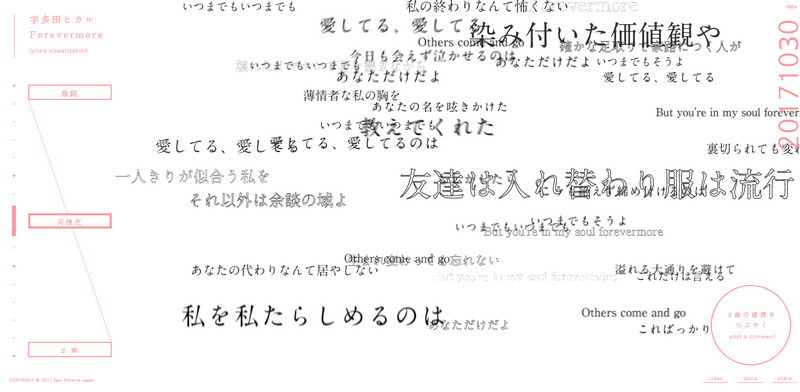
Though sometimes simplicity does not mean ease of implementation – and Lyrics Visualization is a representative example of that. The website looks clean, and a bit plain; but the engine that stands behind this spectacular song visualizer that forms a responsive spherical word cloud is sophisticated and advanced.
The traditional approach with improvements
The first steps in conducting experiments with the typography can be done very easily: just stick to the traditional route and then gradually enhance it with tricks. For example, Language Media. Here the front page of the creative studio has an ordinary video background that serves as a portfolio reel. A tagline that takes up almost the entire screen also looks nothing out of the common. However, a drastically enlarged cursor pointer indicates that something peculiar is going on here.
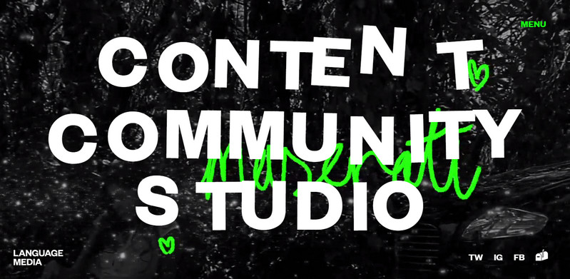
Indeed, if you move the cursor across the letters you will see that each one has a small hover effect that helps to recreate a feeling that the characters are hanging in the mid-air. In this way, the relatively typical design has got a flavor.
It is time to proceed to the more advanced example that is provided by the Nurture Digital.
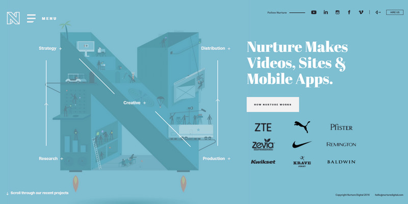
Here the huge letters underlie the entertaining aspect of each slide in the carousel. The welcoming screen features an illustration brought to life that certainly steals the show; the rest use a masking technique to draw the attention. Without doubt, here the masking loses compared to an artistic solution, but it does not mean that it is unable to impress. In A Violent Act it certainly outshines everything else.
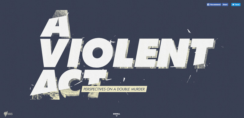
The team behind the project did a great job of creating a real masterpiece with a high-tech vibe. It features both graphical and programming manipulations.
Speaking of which, the computer-generated typography is a whole area to explore.
The computer-generated typography
It is here where the limit is set only by your imagination. For example, you can try to:
- employ particles animation
- recreate physics behavior
- adopt WebGL
- add depth and volume, and much more.
It is for you to decide what technique to adopt. If you need some inspiration, just scroll down we are going to show you real-life examples of outstanding computer-generated typography.
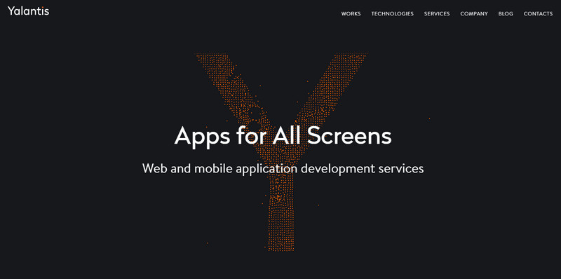
Yalantis employs a beloved and once-popular particles animation enhanced by mouse-based interactivity. The huge letter “Y” placed above the solid monotone background beautifully illustrates the company’s nameplate as well as hints about its sphere of expertise.
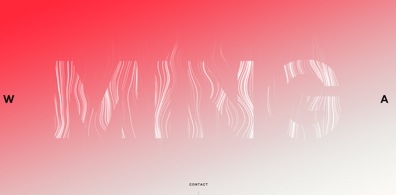
Ming Labs is marked by a smoke-inspired animation that is incredibly adorable. The clean backdrop and an elegant piece at the heart of the screen – are all you need to produce an outstanding first impression.
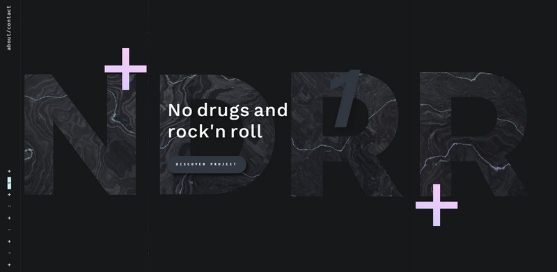
In a nutshell, the front page of Selma Ozatalay’s portfolio utilizes the same solution as Minglabs: you can certainly draw a parallel between these two. The thing that differs is a dynamic centerpiece. Here, it is more brutal, hypnotic and rustic than in the previous example.
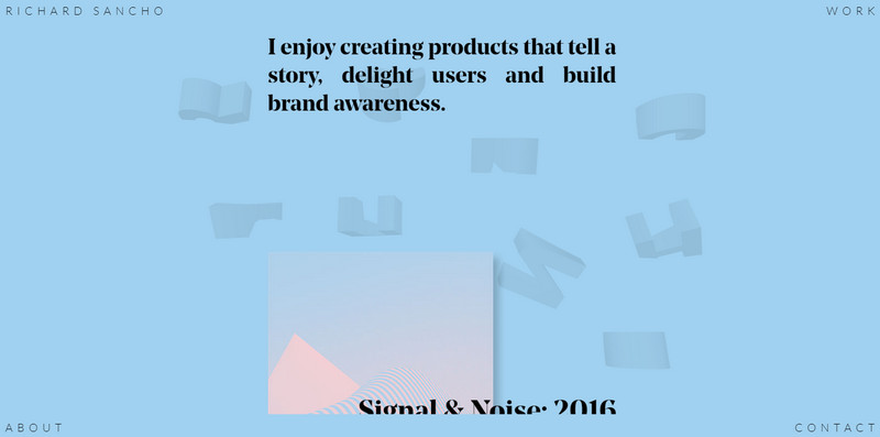
Portfolio of Richard Sancho is enriched with a bunch of 3D symbols that are floating. They nicely merge with the blue backdrop, serving merely as a decoration that gives the project a high-end feeling.
Conclusion
Experiments with the typography are always welcoming. However, let us not forget about several important things. First of all, the technical side can be very daunting and challenging; secondly, browser compatibility and speed are things to concern; thirdly, not everyone is able to estimate the cleverness of the idea that can lead to high bounce rate. And finally, most importantly, no matter how brilliant are your animation and idea, there are people who actually do not need all this stuff – make sure that your experiment is appropriate for your targeted audience.
Though, for those of you who seek a solid starting point you can visit (https://codepen.io/) Codepen for inspiration or Moving Letters project for some ready-to-use solutions.
Originally posted on September 12, 2019 @ 6:17 am